Welcome to El Antroposofista, your premier digital sanctuary for exploring the intricate connections within anthropology, archaeology, psychology, and history. Today, we delve into a fascinating visualization that attempts to map the entirety of human conflict: a compelling time-lapse of every battle in history, as compiled from Wikipedia. This is not merely a display of dots on a map; it is a rich dataset that invites deep academic inquiry into how we record, visualize, and understand organized violence across millennia.
Table of Contents
- Introduction: Mapping the Unseen
- The Algorithmic Historian: Unpacking the Methodology
- Wikipedia as a Lexicon of Conflict
- Navigating the Labyrinth of States and Predecessors
- The Cartography of Absence: Limitations and Biases
- Anthropological & Sociological Lenses on Conflict Visualization
- DIY Guide: Analyzing Historical Data with Spreadsheets
- Frequently Asked Questions
- Conclusion: Beyond the Dots, Towards Deeper Understanding
Introduction: Mapping the Unseen
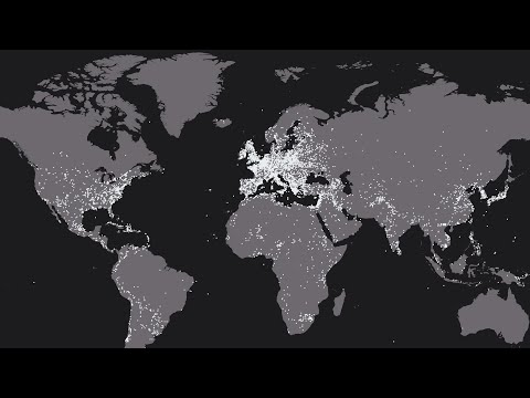
The visualization of historical battles offers a powerful, albeit simplified, narrative of human civilization's recurring engagement with warfare. By representing over 10,000 conflicts as ephemeral dots on a global map, the creator provides a unique perspective, allowing viewers to witness the ebb and flow of organized violence. This approach, while visually striking, demands a rigorous examination from anthropological, archaeological, and historical viewpoints. We must question not only what the map shows but also how it was constructed, what biases it might contain, and what broader societal and sociological patterns it illuminates.
The Algorithmic Historian: Unpacking the Methodology
The creation of such a comprehensive dataset is a testament to the power of computational methods applied to historical research. The methodology, as outlined by the creator, is systematic and relies heavily on publicly accessible digital resources. The process begins with leveraging anthropology's cousin, archaeology, in its modern guise of data archaeology, using tools like the Wikidata Query service. This initial step aims to cast a wide net, identifying potential candidates for inclusion.
The subsequent stages involve meticulous data extraction and cleaning. The creator emphasizes the importance of gathering data from multiple language versions of Wikipedia, acknowledging that knowledge and documentation are not confined to a single linguistic sphere. This multilingual approach is crucial for achieving a more globally representative dataset, aligning with anthropological principles of cross-cultural comparison.
"I created a query with Wikidata Query to get the list of all articles tagged as "battle" by Wikipedia. This gives me about 12,000 battles."
The cleaning process, particularly the removal of duplicate entries, is a critical step in ensuring data integrity. The final figure of 10,624 unique battles represents a significant curation effort, transforming raw data into a structured and analyzable form. This mirrors the work of historical researchers who constantly sift through fragmented evidence to construct coherent narratives.
Wikipedia as a Lexicon of Conflict
The choice of Wikipedia as the primary data source is both a strength and a potential limitation. On one hand, Wikipedia's collaborative nature and extensive coverage mean it acts as a vast, albeit imperfect, repository of information on historical events. Its multilingual presence allows for a broader scope than might be achievable through traditional academic archives alone, which are often geographically or linguistically restricted.
However, Wikipedia is not an academic archive in the traditional sense. Its content is user-generated and subject to consensus, potential biases, and varying levels of scrutiny. The creator’s inclusion criteria—requiring an individual Wikipedia article for each battle—are a pragmatic filter. This process reflects a form of digital archaeology, where digital artifacts (Wikipedia articles) are excavated and analyzed for their embedded information.
"I used Wikipedia as a directory of battles."
The inclusion of data from 27 different Wikipedia versions highlights a sophisticated approach to data acquisition. This multilingual strategy is vital for anyone seeking to understand global phenomena, as it mitigates the ethnocentric biases inherent in relying on a single cultural or linguistic perspective. The effort to standardize and clean this disparate data is a significant undertaking.
Navigating the Labyrinth of States and Predecessors
One of the most complex aspects of mapping historical battles is accurately attributing them to political entities, especially given the fluid nature of statehood throughout history. The creator's methodology addresses this by constructing an index of countries with their predecessor states. This is an essential detail for historical and anthropological accuracy.
Examples like France, the UK, the USA, Russia, Germany, Spain, Poland, Rome, China, and Turkey illustrate the intricate lineage of political formations. This requires a deep understanding of world history and the ability to trace continuities and discontinuities across centuries. The inclusion of specific date ranges (e.g., "France (476 - 2018)") provides a temporal framework for these entities, crucial for the time-lapse visualization.
This approach implicitly acknowledges that modern nation-states are the culmination of long and often tumultuous historical processes. Understanding these predecessor states is vital for comprehending the territorial claims, political ideologies, and cultural legacies that shape contemporary conflicts and international relations. It is a practical application of historical consciousness, essential for any form of critical inquiry into global affairs.
The Cartography of Absence: Limitations and Biases
No dataset, especially one compiled from a dynamic source like Wikipedia, is without limitations. The creator candidly acknowledges that Europe appears to be heavily concentrated with battles. This observation is critical from both a psychology of information and an anthropological perspective.
Several factors could contribute to this perceived imbalance. Firstly, the prevalence of Wikipedia usage and contribution may be higher in certain regions, particularly in Europe and North America. Secondly, the accessibility and preservation of historical military records vary significantly across the globe. Some cultures may have prioritized different forms of historical record-keeping, or their records may have been lost due to conflict, natural disasters, or neglect. The creator also mentions potential Wikipedia bans in countries like China or Turkey, which would naturally affect data completeness.
"Missing data. You probably noticed that Europe concentrates the majority of battles."
This geographical disparity in data representation raises important questions for anthropology and history. Does it reflect a genuinely higher incidence of warfare in Europe, or does it primarily signify a bias in the digital historical record? Research by other scholars, as cited by the creator, suggests that while Europe may indeed have experienced a high frequency of battles, the visualization's geographical skew is likely amplified by data collection biases. This underscores the need for critical engagement with any dataset, especially those purporting to represent global phenomena.
Anthropological & Sociological Lenses on Conflict Visualization
From an anthropological standpoint, this visualization serves as a potent tool for contemplating the human propensity for conflict. It allows us to visualize patterns of aggression, defense, and territorial disputes across time and space. The concentration of dots in certain regions or eras might correlate with known periods of significant historical upheaval, such as the Roman expansion, the Mongol invasions, or the colonial era.
Sociologically, the visualization prompts reflection on the structures and institutions that facilitate or perpetuate warfare. The index of predecessor states highlights the evolving nature of political organization and its relationship to conflict. It implicitly asks: how do changes in statehood, governance, and ideology influence the frequency and scale of battles?
Furthermore, the ephemeral nature of the dots in the time-lapse can be interpreted metaphorically. Battles, however significant in their time, often fade into the broader historical narrative, leaving behind only traces in records and memory. This visualization makes that fading process tangible, reminding us of the transient yet impactful nature of military engagements. It encourages us to consider the long-term consequences of these events, beyond their immediate outcomes, and how they shape cultural identities and social structures.
DIY Guide: Analyzing Historical Data with Spreadsheets
The creator's methodology, while complex, can be approximated for smaller-scale historical inquiries using readily available tools. Here's a basic guide on how you might approach analyzing a list of historical events using spreadsheet software like Microsoft Excel, Google Sheets, or LibreOffice Calc.
- Define Your Scope: Decide on the type of historical data you want to analyze (e.g., battles, treaties, discoveries) and the time period or geographical region. For this exercise, let's assume you're interested in major naval battles of the 19th century.
- Gather Your Data: Compile a list of relevant events. You can use Wikipedia, historical databases, or academic texts. For each event, aim to collect key information such as:
- Name of the Battle
- Date(s)
- Location (Country, Region, Sea)
- Primary Combatants (Nations/Factions)
- Outcome (Victory/Defeat/Draw)
- Estimated Casualties (Optional)
- Key Figures Involved (Optional)
- Create a Spreadsheet: Open your chosen spreadsheet software and create columns for each piece of data you've gathered.
- Input Your Data: Carefully enter the information for each battle into the corresponding cells. Be consistent with your formatting (e.g., date formats, names of countries).
- Standardize and Clean: This is a crucial step, mirroring the creator's process.
- Remove Duplicates: Use the software's duplicate removal tool to find and eliminate any identical entries.
- Standardize Names: Ensure consistency. For example, use "United Kingdom" throughout, rather than sometimes "UK" or "Great Britain." Identify predecessor states if relevant to your scope (e.g., for 19th-century naval battles, you might consider the Royal Navy as representing the British Crown).
- Format Dates: Ensure all dates are in a recognizable format (e.g., YYYY-MM-DD) so the software can sort and filter them correctly.
- Analyze the Data: Use spreadsheet functions to explore your dataset:
- Sorting: Sort battles by date to see chronological progression, or by location to identify hotspots.
- Filtering: Filter for specific combatants, outcomes, or regions. For example, filter to see all battles involving France or all battles that resulted in a decisive victory for one side.
- Pivot Tables: Create pivot tables to summarize data. You could count the number of battles per year, per country, or per outcome. This provides a high-level overview.
- Basic Charts: Visualize your findings. A bar chart could show the number of battles per country. A line chart could track the frequency of battles over time. A pie chart could illustrate the distribution of outcomes.
- Interpret Your Findings: Based on your analysis and visualizations, draw conclusions. What patterns emerge? Do they align with existing historical narratives? What questions does your data raise? For instance, do your 19th-century naval battles reveal a shift in naval power?
This DIY approach, while less sophisticated than the algorithmic methods used for the full Wikipedia dataset, provides a hands-on understanding of data compilation, cleaning, and analysis – core skills in anthropology, archaeology, and historical research.
Frequently Asked Questions
What is the primary source of data for this visualization?
The primary source for the data is Wikipedia, specifically articles tagged as "battle." The creator also utilized Wikidata Query for initial data retrieval.
Why is there a concentration of battles in Europe?
This concentration may be due to several factors, including higher Wikipedia usage and contribution rates in Europe, the availability and preservation of historical military records, and potential biases in digital data collection. It's important to recognize this as a potential data limitation rather than solely a reflection of historical reality.
How are predecessor states handled in the data?
The creator compiled an index of countries and their historical predecessor states (e.g., Roman Kingdom, Roman Republic, Roman Empire, Western Roman Empire for Rome) to accurately attribute battles across different political entities over time.
Are all historical battles included?
No, only battles that have a dedicated article on Wikipedia are included. This means battles with less documentation or those not deemed significant enough for a Wikipedia entry might be omitted.
What are the implications of using Wikipedia as a data source?
Using Wikipedia offers broad coverage and multilingual access but also introduces potential biases, inaccuracies, and the dynamic nature of crowdsourced information. Rigorous data cleaning and acknowledgment of limitations are essential, as undertaken by the creator.
Conclusion: Beyond the Dots, Towards Deeper Understanding
The time-lapse visualization of historical battles, derived from a vast dataset meticulously compiled from Wikipedia, offers a powerful, albeit imperfect, lens through which to view the recurring phenomenon of human conflict. It transforms abstract historical data into a dynamic visual narrative, prompting contemplation on the scale, distribution, and evolution of warfare across millennia.
As scholars of anthropology, history, and psychology, we must engage with such visualizations critically. Understanding the methodology, acknowledging the inherent limitations—particularly the geographical biases stemming from data availability and digital representation—and contextualizing the findings within broader historical and sociological frameworks are paramount. This project serves not only as a testament to the power of data visualization but also as a rich case study in the challenges and opportunities of digital historical research. It reminds us that behind every dot on the map lies a complex web of human decisions, societal structures, and historical contingencies, awaiting deeper exploration.
We invite you to explore further by visiting our official blog for the latest news in anthropology, archaeology, and psychology. Delve into related topics on our other blogs covering diverse fields of knowledge.